AFL Gather Round Guernseys 2026 Ranked From Best to Worst

The AFL Gather Round 2026 showcased unique guernsey designs from ten teams, creating a blend of creativity and nostalgia. The Adelaide Crows topped the list with a fresh yet familiar design, while the West Coast Eagles reinvented their ochre guernsey with an innovative twist. The Gold Coast Suns impressed with their non-traditional pink look. However, not all teams hit the mark, with some opting for safe or divisive designs. Essendon Bombers concluded the ranking with a design that struggled to stand out.
- Adelaide Crows lead with a fresh, familiar design.
- West Coast Eagles revamp ochre guernsey creatively.
- Essendon Bombers' design fails to captivate visually.
AFL Gather Round Guernseys 2026
AFL Gather Round Guernseys 2026 Ranked From Best to Worst
Gather Round always brings something different.
- AFL Gather Round Guernseys 2026 Ranked From Best to Worst
- 1. Adelaide Crows
- 2. West Coast Eagles
- 3. Gold Coast Suns
- 4. Melbourne Demons
- 5. Hawthorn Hawks
- 6. North Melbourne
- 7. Port Adelaide
- 8. Sydney Swans
- 9. St Kilda Saints
- 10. Essendon Bombers
New venues, big crowds, and increasingly, a chance for clubs to experiment with design. In 2026, ten clubs rolled out special guernseys, and the results were exactly what you would expect.
Some nailed it. Some played it safe. Others missed completely.
Based on the transcript breakdown, here is the full ranking of every Gather Round guernsey from best to worst.
1. Adelaide Crows
Adelaide take out top spot with a design that feels both fresh and familiar.
There is something about this jumper that works immediately. It looks clean, it suits the club, and it stands out without trying too hard. Even without a clear retro reference, it carries that classic Adelaide feel.
For a Gather Round design, that balance is exactly what you want.
2. West Coast Eagles
The return of the ochre guernsey was always going to divide opinion.
Once considered one of the worst designs in AFL history, it now sits in a completely different light. Time has turned it into something fun and almost iconic.
The added detail of the wedge-tailed eagle design shaped like Western Australia gives it genuine creativity. It might not be perfect, but as a one-off, it works.
3. Gold Coast Suns
The Suns lean into pink again, and it pays off.
It is not a traditional football look, but that is part of the appeal. Gold Coast have the flexibility to experiment, and this design feels unique without being overdone.
It is clean, distinctive, and suits where the club sits in the competition.
4. Melbourne Demons
Melbourne’s guernsey sits in that middle ground between safe and creative.
The demon watermark design adds something different, and there is enough variation from their standard look to justify it. It may not jump off the page immediately, but it grows on you.
It is a solid design, even if it does not quite hit the top tier.
5. Hawthorn Hawks
Hawthorn’s jumper leans heavily into nostalgia.
The flathead hawk logo references a dominant era in the club’s history, and while that adds meaning, it does not necessarily translate visually for everyone.
The brown and gold base works, but the overall design feels more respectful than exciting.
6. North Melbourne
North Melbourne land right in the middle.
The colours are strong, but the design itself does not quite deliver. It feels more like a training guernsey than a statement piece, lacking the impact you would expect from a one-off design.
There is nothing wrong with it, but not much that stands out either.
7. Port Adelaide
Port Adelaide’s teal-heavy design is one of the more divisive entries.
At times it looks sharp and different. At others, it feels slightly gimmicky. That inconsistency is what holds it back.
It is not a bad guernsey, but it does not quite hit the mark compared to what Port have produced in the past.
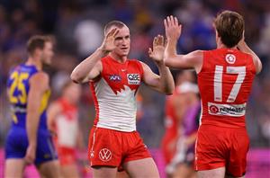
8. Sydney Swans
Sydney opted for a retro-inspired look, but it lacks impact.
There is nothing wrong with the design itself, but it feels too close to their standard guernsey to really stand out. For a Gather Round opportunity, it feels like a missed chance to do something more creative.
Safe, but forgettable.
9. St Kilda Saints
St Kilda’s design draws immediate comparisons to an Uno reverse card.
The colours are strong, and the club identity is clear, but the overall look feels a little too gimmicky. It is the kind of design that might not age particularly well.
There is an idea there, but the execution does not quite land.
10. Essendon Bombers
Essendon finish at the bottom.
The red-heavy look, combined with the red shorts, gives off an unusual feel that does not quite translate as a football guernsey. It lacks the sharpness and identity that Essendon’s colours usually provide.
There was an opportunity to do something bold with red and black, but this version does not quite get there.
Related

Top Betting Sites
Betting offers
Upcoming Events
03 October 2026
- Eagle Farm- October 3 -
- Horse Racing
- Randwick- October 3 -
- Horse Racing
- Flemington- October 3 -
- Horse Racing
- Murray Bridge - October 3 -
- Horse Racing
- Saturday Roughies - October 3 -
- Horse Racing
- Flight Stakes -
- Horse Racing
- Turnbull Stakes -
- Horse Racing
- Epsom Handicap -
- Horse Racing
- Kalgoorlie - October 3 -
- Horse Racing
- The Metropolitan Super Dabble -
- Horse Racing
- Brisbane Bullets vs Tasmania JackJumpers -
- Basketball
- Melbourne United vs Cairns Taipans -
- Basketball
- Warrington Wolves vs Wakefield Trinity Super League Grand Final -
- Rugby League
04 October 2026
- NRL 2026 Grand Final -
- Rugby League
- 2026 Clive Churchill Medal Betting Tips - Walker & Ponga Favourites for a Reason
- 2026 NRL Grand Final First Try Scorer Tips & Predictions - Sydney Roosters vs Newcastle Knights
- Sydney Roosters vs Newcastle Knights NRL Grand Final 2026 Tips - Knights To Keep It Close
- NRL Grand Final Betting Specials - Best Promos for Roosters vs Knights
- Roosters vs Knights NRL Predictions - Threading the needle with some long odds Grand Final SGMs backed by stats
- NRL Grand Final Same Game Multi Predictions - 35+ betting stats & player prop trends to build your SGM with CrownBet
- NRL Grand Final Team Lists 2026: Roosters vs Knights Teams
- 2026 NRL Grand Final Sydney Roosters vs Newcastle Knights Early Predictions
- 2026 NRL Premiership Winner Odds - Weekly Blogg & Updated Markets
10 October 2026
- Toorak Handicap -
- Horse Racing
- Might And Power Stakes -
- Horse Racing
- Caulfield Guineas -
- Horse Racing
Load More